Hello there!
It’s been a while since my last lettering post (or blog post for that matter), but I’ve got some time off of work and I’m ready to dive into all things comics.
For this edition of Lettering Studies, I am taking a look at the work of Rus Wooton from the Daniel Warren Johnson epic series, Extremity. In this go round, I am also going to try a slightly different format. I want to analyze the effort put into the typographic strategies so that new or even seasoned comic book letterers have an easy reference point for some techniques to deploy in their own books. Additionally, this study will focus solely on sound effects rather than the lettering of the entire book.
All right, let’s get to it then.
TECHNIQUE 1 - Artwork Overlap
In this technique you will see artwork in the panels that overlaps (or goes on top) of the typography. This creates dynamic and diverse interplay with the characters and action of the scene. Using artwork overlap is also very effective at reducing the amount of friction with the images on any given panel. Meaning if you don’t overlap, then the typography can start blocking vital pieces of the artwork (In most cases you don’t want to do that). So then you either have to shrink the type size or restrict what is seen. Implementing this last fact is a bit of a judgement call and has to be based off what makes sense for the setting. However, with artwork overlap you often get the best of both worlds.
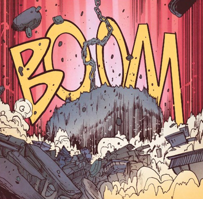
Here is an example to marvel at:
The type is large and seamlessly meshes with what noise is being implied by the ship crashing into the fortress. Now, the typography could have easily gone on top of the artwork and the panel would still have worked, but the trade off is you loose the detail of the ship.
MINI TECHNIQUE:
In this example there is excellent use of cropping as well. Often times the full word doesn’t need to be seen for someone to understand what is trying to be communicated.
Here are a few more stunning examples of this technique in action:
SIDE NOTE
For newcomers to lettering, when designing overlaps such as these, I would recommend doing so in Adobe Photoshop. It can be achieved in other programs, but Photoshop will give you the greatest amount of control, precision, and versatility.
TECHNIQUE 2 - Multiple Fonts
Now this technique can be hard to stomach if you come from a graphic design background such as myself, where general theory recommends sticking with 2 to 3 typefaces per design. However, comic book lettering doesn’t really adhere to that rule. It’s a bit of a free-for-all in terms of quantity and styling. The way I look at it is that sound effects in comic books are trying to mimic what you would hear in reality. As a result, certain typefaces may work better visually representing a sound than another might. So it’s more of trying to match the typeface for each individual sound rather than sticking with one font based on arbitrary design rules.
Not to say that going with one typeface for the sound effects wouldn’t work or look bad, it really depends on the aesthetic tone you are trying to capture in your book. (For reference, see Lettering Study 2 for Darywn Cooke’s, Parker: The Score. The typeface for sound effects is pretty much the same throughout the book, but there are other effects/techniques applied that make them still visually interesting.)
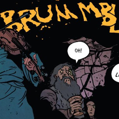
Here you can see a few examples of the wide range of styles used. Each has a function and marries up perfectly with the sound trying to be achieved:
Here the typeface has a more blocky shape with straighter edges that simulates a high tech screech straight out of Star Wars.
To gain a shaking motion, the typeface has morphed and jagged edges and lacks a consistent baseline.
A more hand done typeface helps create an organic/natural tone that has a lot of variety within the letter forms.
This marker style works well to create legible sound effects that are a bit quieter and more subdued in nature.
This typeface has a brush stroke quality to it that looks like spattering blood, which ties in with what is happening to the character making the noise.
Big bold typeface that has a bunch of jagged edges that are cohesive with the tiny flying specs throughout the scene.
TECHNIQUE 3 - Stroke
Adding a stroke to a typeface creates another layer of separation between the background. A stroke also gives you opportunities to make unique color schemes. Another benefit is that it can add legibility to the sound effect if it is set over a complex or super detailed scene. It’s a simple technique to apply, but can add just that little something extra.
A stroke can be seen in many of the other examples shown, but here’s a few more anyway:
TECHNIQUE 4 - Non Uniformity
It’s rare to see a sound effect set in the default baseline that is typed out. Overlapping, rotating individual letters, and offsetting baselines are some of the methods applied to a single word in a sound effect. Language and sounds in the real world have vibrations to them that aren’t uniform, so having these effects applied mimics the natural deviations to sound. Artwork in comics have many variations in scale, line weight, and texture. Exaggeration of form is common place, so by having the type set in a non uniform way makes it mesh in a stronger fashion.
Again, many of the other examples shown in other techniques implement a non uniform structure, but here is another example regardless:
CONCLUSION
So if you are new to comic book lettering or are a seasoned pro looking for some sound effect inspiration, give these techniques a try.
Artwork Overlap
Multiple Fonts
Stroke
Non Uniformity
Happy Lettering!
Here are all of the credits for the Extremity artwork and writing seen above.
Daniel Warren Johnson (Writer/Artist)
Mike Spicer (Colorist)
Rus Wooton (Letterer)
Image/Skybound (Publisher)
Release Year: 2017